
8 Brochure Design Mistakes That Lose Customer Attention
A brochure is not a document-storage box. It is a guided sales conversation.
The reader needs a path
A brochure should move from problem and promise to proof, details and action. Random content blocks force the reader to build the story themselves.
Mistake 1: Starting without a content hierarchy
Decide the cover message, section sequence and primary CTA before decoration.
Mistake 2: Making every line important
When everything is bold, nothing stands out. Use size, weight, spacing and colour intentionally.
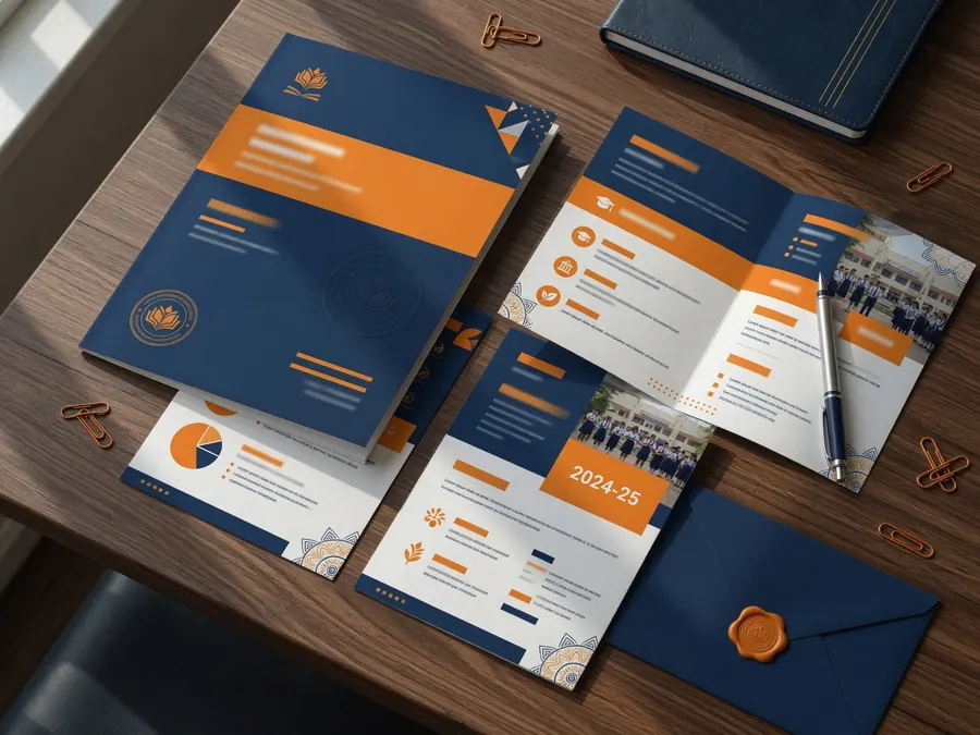
Mistake 3: Using low-quality or unrelated images
Images should support the real service, audience and brand. Check print resolution and permissions.
Mistake 4: Writing long unbroken paragraphs
Use subheads, bullets, captions and short sections for scanning.
Mistake 5: Forgetting the reader’s questions
Address price approach, process, suitability, proof and contact details where appropriate.
Mistake 6: Hiding the CTA
Make the next action specific and repeat it at logical points.
Mistake 7: Ignoring print production
Confirm size, folds, bleed, safe margins, colour profile and paper before final export.
Mistake 8: Publishing outdated information
Assign one owner to verify dates, numbers, QR codes, contact details and policy claims.
Review with a printed prototype
A physical test reveals fold problems, small text and image issues that are easy to miss on a monitor.
Common questions
Use enough information to support the decision, but organise it into scannable sections with a clear hierarchy.
They can share design, but interactive links, page flow, colour and file weight may require separate exports.
Turn this advice into a clear design system.
Explore Circle Design professional brochure design or share your current brand for a focused review.
Was this guide useful?
Share your question or practical experience. Your message will be delivered privately to Circle Design on WhatsApp; public comment storage requires a separate backend.