
7 Logo Design Mistakes That Make a Small Business Look Cheap
Your logo may be simple—but it should never make your business look careless.
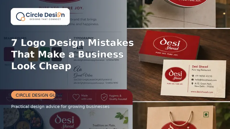
A logo is a trust shortcut
Customers often see your logo on a WhatsApp profile, shop board, visiting card or Instagram post before they speak to you. The logo does not need to explain everything, but it must look intentional, readable and consistent.
Mistake 1: Trying to show the entire business
A logo is an identifier, not a brochure. Adding every product, service, landmark and slogan creates visual noise. Choose one memorable idea and let the rest of the brand system explain the business.
Mistake 2: Using too many fonts and colours
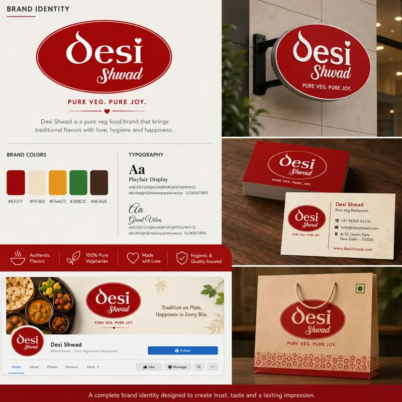
Multiple decorative fonts and unrelated colours make a logo difficult to recognise. Define a small colour palette and one clear type direction that can work across print and digital use.
Mistake 3: Designing only for a large screen
A logo that looks attractive on a presentation may fail as a 40-pixel Instagram profile image. Test it in small sizes, one colour, black and white, and on both light and dark backgrounds.
Mistake 4: Copying a competitor
Similarity may feel safe, but it removes distinctiveness and can create legal or reputation problems. Use competitor research to understand category expectations—not to reproduce their mark.
Mistake 5: Ignoring typography spacing
Poor letter spacing, inconsistent alignment and awkward icon-to-name proportions make even a good idea feel unfinished. Optical balance matters more than simply centring every element mathematically.
Mistake 6: Depending on effects
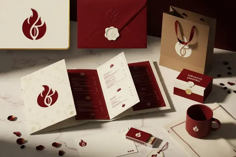
Shadows, gradients and 3D effects can support a campaign, but the core logo should work without them. Start with a strong flat version and then define approved variations.
Mistake 7: Not collecting the correct files
A transparent PNG alone is not enough for every use. Request appropriate vector or print-ready exports, colour references and a basic usage note so future vendors can reproduce the logo correctly.
A practical next step
Place your logo beside three competitors, reduce it to profile-image size and print it in black and white. If it remains clear and recognisable, the foundation is likely strong.
Common questions
Use trends carefully. A logo should remain usable and recognisable after a trend fades.
Most small-business identities work well with one primary colour, one supporting colour and neutrals.
Turn this advice into a clear design system.
Explore Circle Design professional logo design or share your current brand for a focused review.
Was this guide useful?
Share your question or practical experience. Your message will be delivered privately to Circle Design on WhatsApp; public comment storage requires a separate backend.