
The Brand Consistency Checklist Every Small Business Needs
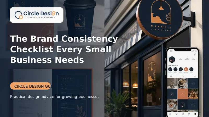
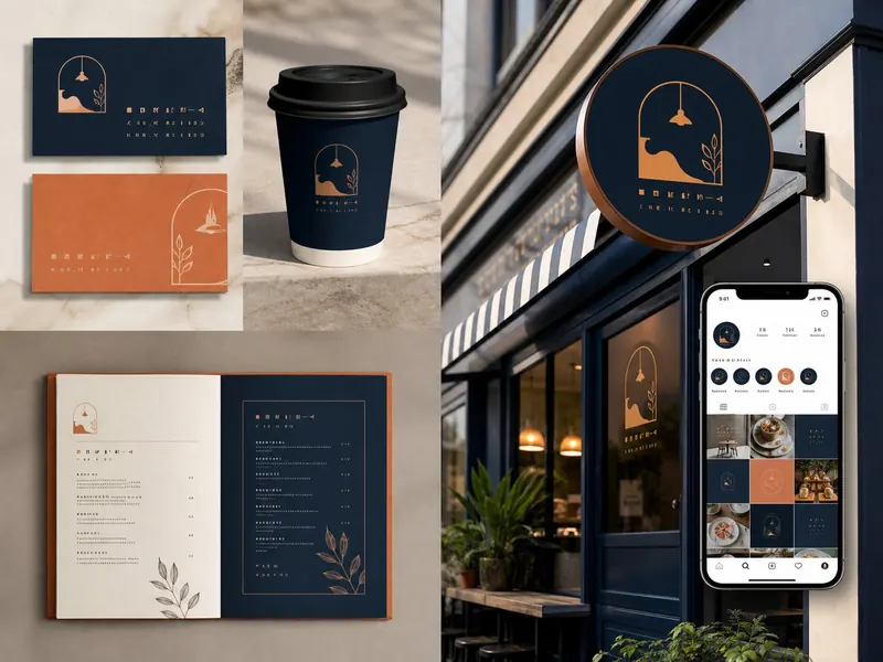
Consistency does not mean every design looks identical. It means customers always recognise who is speaking.
Why inconsistency costs trust
Different logos, colours, phone numbers or messages make a business appear less organised. Consistency helps customers recognise the brand across online and offline touchpoints.
Logo checklist
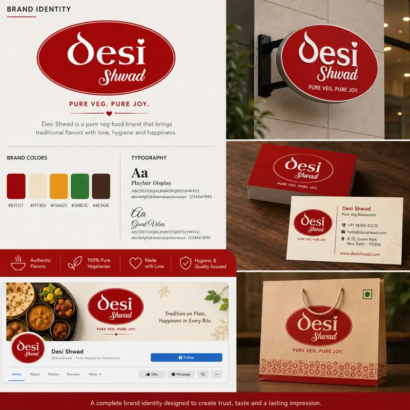
Use approved versions, protect clear space, maintain proportions and avoid unapproved effects or colours.
Colour checklist
Document primary, supporting and neutral colours with digital and print references.
Typography checklist
Choose readable heading and body fonts and define simple size/weight rules.
Image checklist
Use a consistent subject style, crop, lighting and editing approach. Avoid irrelevant stock imagery.
Message checklist
Repeat the same core promise, audience and service names. Adjust tone by platform without changing facts.
Contact checklist
Keep business name, phone, domain email, address/service area and working hours consistent everywhere.
Template checklist
Create practical templates for social posts, presentations, quotations, brochures and email signatures.
Quarterly review
Every three months, review the website, Google profile, social accounts, print material and proposals together. Correct outdated assets at the source.
Common questions
Yes. A concise guide covering logo, colours, typography, imagery and basic templates can be enough.
No. Clear boundaries make it easier to create varied communication that still feels connected.
Turn this advice into a clear design system.
Explore Circle Design brand identity design or share your current brand for a focused review.
Was this guide useful?
Share your question or practical experience. Your message will be delivered privately to Circle Design on WhatsApp; public comment storage requires a separate backend.