
A realistic business scenario—clearly identified as a concept.
This transparent concept case study demonstrates the process Circle Design would use for an independent Delhi cafe preparing to launch. It is a design demonstration, not a claim about an unidentified paying client.
Turning scattered communication into one clear customer journey.
A new cafe can have good food and still appear inconsistent when its signboard, menu, packaging, delivery profile and Instagram use different visual styles. The communication challenge is to create one recognisable identity that works at a small profile-image size and on large physical surfaces.
Research, visual direction and practical rollout.
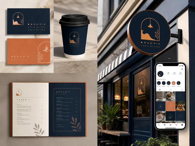
The proposed Circle Design approach begins with audience and competitor review, followed by a memorable logo direction, navy-and-orange colour system, practical typography and a flexible set of launch applications. Deliverables shown include identity presentation, menu direction, takeaway packaging, storefront signage and social-media launch assets.
Proposed deliverables
- Logo and compact logo variation
- Colour and typography direction
- Menu and takeaway packaging concept
- Storefront and signage visualisation
- Social launch creative direction
What the final design system demonstrates.
The completed concept demonstrates a more consistent customer journey: the same visual cues connect the storefront, packaging, menu and digital profile. No revenue, footfall or enquiry claims are made because this page is a demonstration concept.
Transparency note
This is a fictional demonstration concept created to explain Circle Design’s process. Replace it with an approved real-client case study when client identity, testimonial and measurable results can be verified.